The increase in fuel costs has meant lifestyle changes for many — drastic in some cases. Yet the one area I had never expected to see changes were colours. Reds, blues and yellows — those simple primary colours we take for granted — must be insanely expensive now.
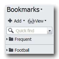
At least, that’s the assumption I’m operating under after seeing Opera 9.5’s new interface. Everywhere you look it’s monochrome. Blacks and soul-sucking grays abound.


Bright colours are so few they’re generally shocking when they make an appearance in Opera’s new default skin.

Oh my god, green for the reload page button. Green! I remember that colour! The colour of the leaves on trees! Remember trees, kids? No? Damn global wanging.
What happened, Opera? Why is the default scheme so depressing? Was the entire Norwegian team experiencing SAD when the interface was being worked on?
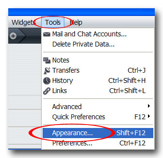
Regardless of the reasons, changing the skin is a simple matter in Opera. Hit Shift+F12 (or select the “Appearance…” option under the Tools menu):

Now select the “Find more skins” radio button. This should load the Editor’s picks for alternate Opera skins.

Select one and you’re good to go.
