In the three and a half years I’ve been using WordPress, I’ve always used themes created by others.
When I first installed the content management system, I kept faith with the default theme until I grew sick of it. This took all of five minutes. I then looked around for a look I liked and settled on Hadley Wickham’s classy Rubric theme. I stuck with that for a long time before switching to Kubrick in 2005 and then to Blue Zinfandel last year.
I’ve made minor changes to each of those but I was leery of making drastic overhauls, preferring instead to simply download a new theme whenever I felt the need. With so many free WordPress themes to choose from, why bother creating your own, right?
Well, the thing is themes tend to reflect their authors biases and personal views. This is perfectly understandable, of course. But each theme author not only seems to have his or her own idea of how a web site should look like (which is all right) but also how it should function (which can be a little irritating). These biases can be minor (i.e. not bothering to list the year for entries) or major (i.e. limiting the main column to a width of 450 pixels). Some of these theme author quirks can be easily changed by users but some would take a lot of tinkering.
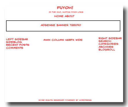
My project for this year is to create my own theme to fit my specific needs for this site. For the time being, I’m going to concentrate on getting the framework up and running and leave typography, colours and other visual pizazz for later iterations. This is the general design I have in mind.

The main column will have a fixed width of 468 pixels. The reason for this is two-fold. One, 468 pixels plus regular-sized fonts ought to result in each line having 72 to 80 characters of text which, readability-wise, is what I feel comfortable with. The other reason for that column width is I’ve been using images that are 450 pixels wide for the past few years and a column width smaller than that might result in Wacky Things Happening. I don’t want Wacky Things Happening and I suspect neither do my visitors.
I definitely want two sidebars. The left one will be reserved for the sideblog as well as links to recent comments and posts. The right sidebar will be for navigation purposes and will have the search bar, monthly archives, categories and tags.
Now that I’ve settled on a rough design, it’s time to look around for GPL or Creative Commons themes that I’m free to modify. The reason I’d rather not start from scratch is that I’m not intimately familiar with HTML, CSS and PHP and it will take a while to come to grips with all that. One of the things that I’m dreading is cross-browser compatibility problems and the best theme authors have that all worked out already.
So, the Fuyoh! theme target for next week is to scout around for suitable themes to use as starting points.
